
Master Conditional Formatting for Stunning Reports
When it comes to creating engaging and insightful reports in Excel, Conditional Formatting is a game-changer. It allows you to dynamically format your data based on specific conditions, making it easier to spot trends, outliers, and key insights. Whether you’re highlighting top-performing sales, overdue tasks, or duplicate entries, mastering Conditional Formatting can transform your reports from plain to powerful.
In this guide, we’ll explore how to use Conditional Formatting like a pro and create stunning, data-driven reports.
1. What is Conditional Formatting?
Conditional Formatting is an Excel feature that automatically changes the appearance of cells based on predefined rules. You can apply different colors, icons, and data bars to make your reports more readable and visually appealing.
Why Use Conditional Formatting?
✅ Highlight key data points (e.g., top 10 sales, overdue invoices)
✅ Improve readability of large datasets
✅ Visualize trends with heatmaps and color scales
✅ Identify duplicates, errors, or outliers quickly
2. How to Apply Basic Conditional Formatting
Applying Conditional Formatting in Excel is simple:
Steps:
- Select your data range (e.g., A2:A100).
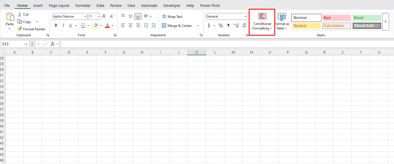
- Go to the Home tab → Click Conditional Formatting.
- Choose a formatting rule from the dropdown menu.
- Customize the formatting options and click OK.
3. Essential Conditional Formatting Techniques
A. Highlighting Duplicate Values
Duplicate values can cause errors, especially in lists like customer emails, order numbers, or inventory records.
📌 How to highlight duplicates:
- Select the range (e.g., A2:A100).
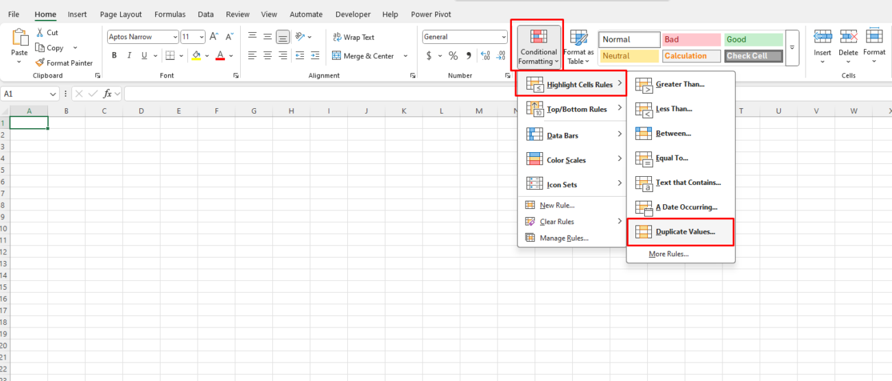
- Go to Home → Conditional Formatting → Highlight Cell Rules → Duplicate Values.
- Choose a formatting style (e.g., red fill, bold text) and click OK.
🔹 Pro Tip: Use this technique to clean up datasets and eliminate redundancy.
B. Using Color Scales for Data Analysis
Color scales apply a gradient of colors based on the value in each cell, making it easy to identify patterns.
📌 How to apply a color scale:
- Select the range of numbers (e.g., B2:B100 for sales data).
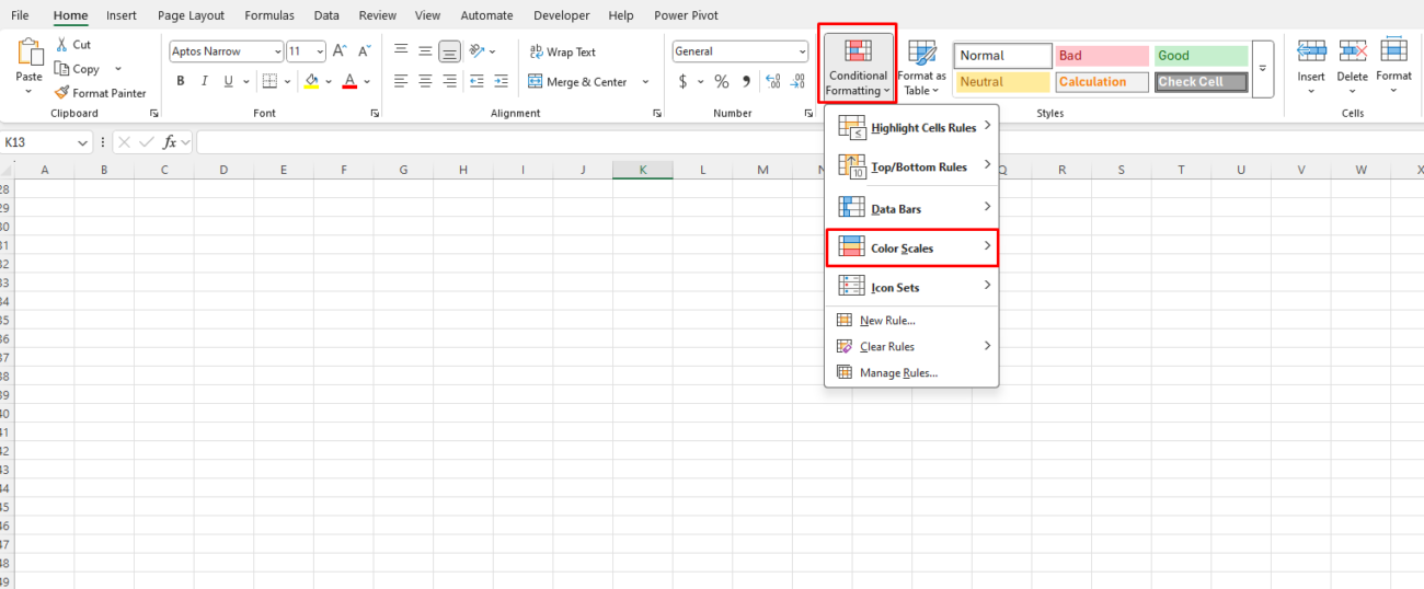
- Go to Home → Conditional Formatting → Color Scales.
- Choose a three-color or two-color scale based on your preference.
🔹 Best for: Sales performance tracking, temperature data, financial reports.
C. Highlighting the Top 10 or Bottom 10 Values
Want to quickly find your top-performing employees or best-selling products?
📌 How to highlight top values:
- Select the data range (e.g., C2:C100 for revenue).
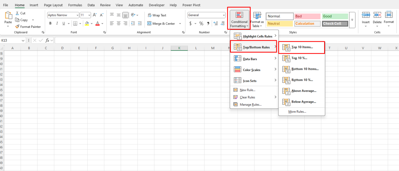
- Go to Home → Conditional Formatting → Top/Bottom Rules → Top 10 Items (or Bottom 10).
- Adjust the number of values and select a format.
- Click OK.
🔹 Pro Tip: You can adjust the number of items (e.g., Top 5 instead of Top 10).
D. Using Data Bars for Instant Comparisons
Data bars create an in-cell bar chart, making it easy to compare values at a glance.
📌 How to apply data bars:
- Select a column of numerical data.
- Go to Home → Conditional Formatting → Data Bars.
- Choose a solid or gradient fill.
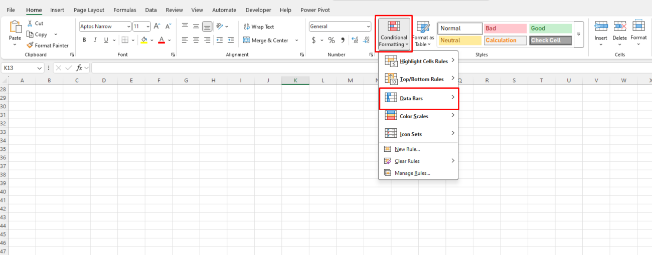
🔹 Best for: Comparing sales, employee performance, or project completion percentages.
E. Highlighting Dates Based on Deadlines
If you manage deadlines, you can format cells based on upcoming or overdue dates.
📌 How to highlight overdue tasks:
- Select the date column (e.g., D2:D100).
- Go to Conditional Formatting → New Rule → Use a formula to determine which cells to format.
- Enter this formula to highlight overdue dates:
=TODAY()>D24. Set a red fill color for overdue tasks and click OK.
🔹 Pro Tip: Modify the formula to highlight tasks due within the next 7 days:
=AND(D2-TODAY()<=7, D2>=TODAY())4. Advanced Conditional Formatting with Formulas
For even more control, use custom formulas in Conditional Formatting.
A. Highlighting Rows Based on a Condition
To highlight an entire row when a certain condition is met (e.g., highlighting overdue orders in a table):
📌 Formula:
=$C2="Overdue"- Select the entire dataset (e.g., A2:E100).
- Go to Conditional Formatting → New Rule → Use a formula to determine which cells to format.
- Enter the formula above and choose a formatting style.
- Click OK.
🔹 Best for: Task tracking, project management, customer service tickets.
B. Creating a Dynamic Heatmap with Custom Ranges
To create a heatmap for a numerical dataset:
📌 Formula for high values:
=A2>1000📌 Formula for low values:
=A2<500
- Select the range (e.g., A2:A100).
- Go to Conditional Formatting → New Rule → Use a formula to determine which cells to format.
- Enter the formula and set the formatting (e.g., green for high values, red for low values).
🔹 Best for: Financial analysis, customer order volume, sales performance.
5. Managing and Removing Conditional Formatting
How to Manage Rules Efficiently:
- Go to Home → Conditional Formatting → Manage Rules.
- Edit or delete specific rules as needed.
- Click Apply to update the changes.
How to Remove Conditional Formatting:
- Select the range.
- Go to Home → Conditional Formatting → Clear Rules.
- Choose to remove formatting from the entire sheet or a selected range.
Get the cheapest Office keys with instant delivery and genuine activation—unlock Microsoft Office at unbeatable prices today!

