How do you use the Stepped Line Chart in PowerPoint?
Charts are indispensable tools for presenting data visually. Among the many chart types available, the stepped line chart is particularly useful for showing changes between intervals, especially when data points are discrete events. In this blog post, we will provide a step-by-step guide on how to create and customize a stepped line chart in PowerPoint.
Step 1: Open PowerPoint and Create a New Slide
- Launch Microsoft PowerPoint.
- Open an existing presentation or create a new one.
- Insert a new slide where you want to place the stepped line chart.
- Go to the Home tab.
- Click on New Slide.
- Choose a slide layout that suits your needs (e.g., Title and Content).
Step 2: Insert a Line Chart
- Go to the Insert tab on the ribbon.
- Click on Chart in the Illustrations group.
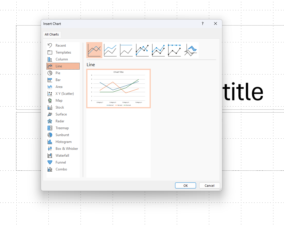
- In the Insert Chart dialog box, select Line from the left pane.
- Choose the default line chart type and click OK.

Step 3: Enter Your Data
- A chart placeholder with sample data will appear, along with an Excel spreadsheet.
- Replace the sample data with your own data in the spreadsheet.
- Close the Excel window once you’ve entered your data.
Step 4: Convert to Stepped Line Chart
PowerPoint does not have a built-in stepped line chart option, so you will need to manually adjust the data points to simulate a stepped effect.
- Go to the Chart Tools Design tab on the ribbon.
- Click Select Data to open the Select Data Source dialog box.
- Click on Add to add a new series if necessary.
Adjusting Data Points for Stepped Effect
- In the Excel spreadsheet, insert new rows between your original data points.
- Copy the Y-values (vertical values) from each original data point into the new rows you inserted.
- For each new row, copy the X-value (horizontal value) from the previous row.
- This will create horizontal segments in your chart, followed by vertical steps at each original data point.
Step 5: Customize Your Chart
- Click on the chart to select it.
- Go to the Chart Tools Format tab on the ribbon.
- Use the available options to style your chart:
- Change Colors: Click on Change Colors to select a preset color scheme.
- Chart Styles: Use the style gallery to quickly apply a new style.
- Format Pane: Open the Format Chart Area pane for more detailed customization like line styles and effects.
Step 6: Add Data Labels (Optional)
- Click on the chart to select it.
- Go to the Chart Tools Design tab.
- Click on Add Chart Element in the Chart Layouts group.
- Select Data Labels and choose the desired position (e.g., Center, Inside End).
Unlock the full potential of your productivity by purchasing the cheapest Office Keys available, offering all the features you need at an unbeatable price.

