Visualizing Data with Excel’s Advanced Charts and Graphs
Data visualization is one of the most effective ways to communicate insights and trends. If you are presenting financial reports, analyzing sales performance, or tracking project progress, Excel’s advanced charts and graphs allow you to present your data in a clear, visually compelling way. In this blog, we’ll explore how to make the most of Excel’s advanced charting features to enhance your data presentations.
Why Use Excel’s Advanced Charts and Graphs?
Excel offers a wide array of charting tools that allow you to represent your data in various formats, from basic line and bar charts to more advanced options like scatter plots and histograms. These tools make it easier for both you and your audience to identify patterns, trends, and outliers in your data, leading to better insights and decision-making.
Using advanced charts and graphs can:
- Improve understanding of complex data.
- Highlight key trends and comparisons.
- Make your data-driven presentations more engaging.
- Help identify relationships and outliers within your data.
Choosing the Right Chart Type
Excel offers numerous chart types, each designed for specific types of data. Choosing the right chart is essential for delivering a clear message. Here are some advanced chart types you can use:
a. Combo Chart
A combo chart combines two or more chart types in one graph, making it ideal for comparing different data sets. For example, you might use a bar chart for sales data and a line chart to display profit margins on the same graph.
How to create a combo chart:
- Select the data range you want to plot.
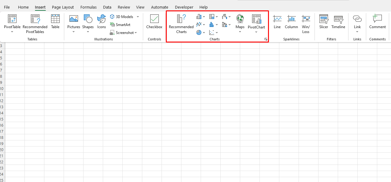
- Go to the Insert tab, click on Combo Chart, and choose a style (e.g., clustered column – line on secondary axis).
- Customize your chart by selecting which data series should appear as columns, lines, or other chart types.
Combo charts are particularly useful when you need to compare different units of measurement, such as revenue vs. expenses.
b. Waterfall Chart
Waterfall charts are perfect for understanding how an initial value is affected by a series of positive or negative values. They are commonly used in financial analysis to visualize profit and loss, cash flow, or other incremental changes over time.
How to create a waterfall chart:
- Select your data and go to the Insert tab.
- In the Charts group, select Waterfall Chart.
- Excel will automatically add the appropriate data series to the chart, showing how each value contributes to the final total.
Waterfall charts are great for showing how a sequence of events impacts a starting value, like a company’s monthly revenue changes.
c. Treemap
Treemaps display hierarchical data as a set of nested rectangles. The size and color of the rectangles are based on the values they represent, making this chart ideal for visualizing proportions within a large data set, such as market share or inventory data.
How to create a treemap:
- Select your data and navigate to the Insert tab.
- Choose Treemap from the Hierarchy Charts section.
- Excel will automatically organize your data into a visual hierarchy, with the largest items at the top and the smaller items nested within them.
Treemaps are particularly useful for analyzing proportions in a complex data set with multiple categories.
d. Radar Chart
Radar charts (also known as spider or web charts) are useful for displaying multivariate data. They allow you to visualize data points across multiple categories and see how they compare against each other.
How to create a radar chart:
- Select your data and go to the Insert tab.
- In the Charts group, select Radar.
- Excel will generate a circular chart with several axes, each representing a data category.
Radar charts are ideal for comparing multiple variables, such as performance metrics or customer satisfaction scores.
e. Funnel Chart
Funnel charts are used to represent stages in a process, showing how data is progressively filtered or narrowed. These are commonly used in sales, marketing, and project management to visualize conversion rates or task completion progress.
How to create a funnel chart:
- Select your data and go to the Insert tab.
- Choose Funnel Chart from the Hierarchy Charts section.
- Excel will display a funnel-shaped chart to illustrate the flow of data across different stages.
Funnel charts are effective for showing the drop-off at each stage of a process, such as from leads to sales conversions.

Customizing Your Advanced Charts
Once you’ve created an advanced chart, you can customize it to ensure it conveys the right message. Excel allows you to adjust chart elements like the title, axis labels, legend, and data labels. Here’s how you can make your charts stand out:

a. Chart Design and Layout
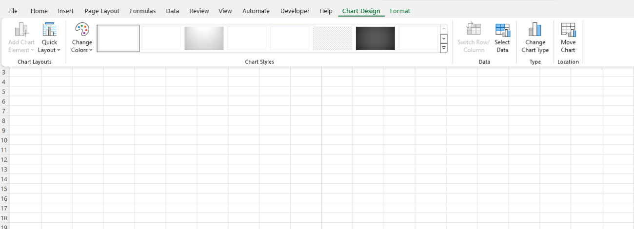
- Use the Chart Design tab to change the overall style of the chart. You can select different color schemes or predefined layouts to make your chart more visually appealing.
- The Quick Layout options let you quickly change the placement of chart elements, such as the legend or data labels.
b. Format Data Series
- You can change the colors, patterns, or markers for each data series by selecting the series and clicking Format Data Series.
- Use this feature to highlight specific data points or distinguish between different data sets.
c. Add Trendlines
- Trendlines are useful for showing overall trends in your data. You can add them by right-clicking a data series and selecting Add Trendline.
- Excel offers various types of trendlines, including linear, exponential, and moving average, to match the behavior of your data.
d. Data Labels and Annotations
- Adding data labels can help to make your chart easier to understand by showing the exact values at each data point.
- You can also add annotations to explain particular trends or data points directly on the chart.
Interactivity and Dynamic Charts
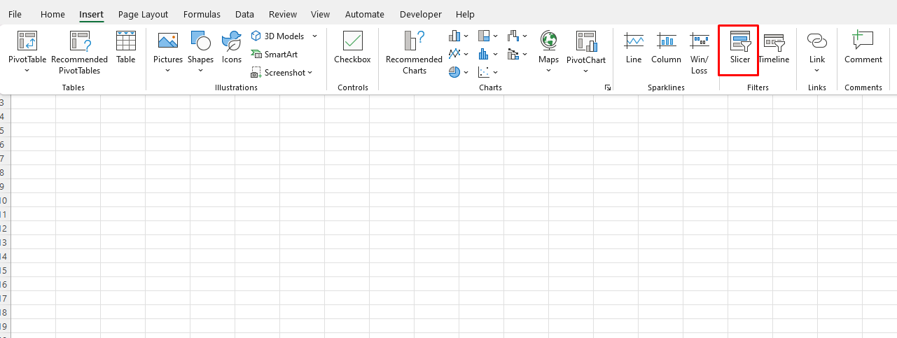
Excel also lets you create interactive charts with features like slicers and PivotCharts. Slicers allow users to filter data dynamically, providing a more flexible way to explore and present data.
How to add a slicer:
- If you’re working with a PivotTable or PivotChart, go to the Insert tab.
- Click Slicer and choose the fields you want to filter.
- The slicer will appear as a separate panel, allowing users to interact with the data by selecting specific categories.

Get cheap Office Keys at unbeatable prices—quality and affordability in one simple solution!

