Excel PivotTables for Sales and Marketing Reporting
Excel PivotTables are indispensable tools for sales and marketing teams looking to analyze data and generate insightful reports. With their ability to summarize, filter, and organize large datasets, PivotTables can provide actionable insights to drive business growth. This blog post will explore how to use Excel PivotTables effectively for sales and marketing reporting.
Why Use PivotTables for Sales and Marketing?
PivotTables offer several benefits for sales and marketing professionals:
- Quick Data Summarization: Consolidate large datasets into digestible summaries.
- Customizable Reports: Tailor data views based on metrics, regions, products, or time periods.
- Real-Time Analysis: Update reports dynamically as data changes.
- Ease of Use: Create detailed reports without extensive technical knowledge.
- Data-Driven Decision Making: Highlight trends, performance metrics, and areas needing improvement.
Steps to Create a PivotTable for Sales and Marketing Reporting
1. Organize Your Data
Ensure your data is well-structured before creating a PivotTable:
- Use a tabular format with clear headers.
- Avoid blank rows or columns.
- Ensure consistency in data types (e.g., dates, numbers, text).
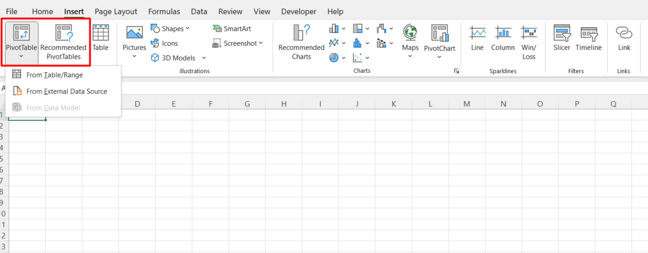
2. Insert a PivotTable
- Select your data range.
- Go to Insert > PivotTable.
- Choose where to place the PivotTable (new worksheet or existing worksheet).

3. Configure the PivotTable Fields
Drag and drop fields into the following areas:
- Rows: Organize data by categories (e.g., region, product name).
- Columns: Compare data across multiple variables (e.g., quarters, sales channels).
- Values: Calculate metrics like total sales, revenue, or average order value.
- Filters: Apply top-level filters (e.g., specific time periods or regions).
4. Add Calculations
PivotTables allow you to add calculations without altering your source data:
- Summarize Values: Change the summary function (e.g., SUM, AVERAGE, COUNT).
- Calculated Fields: Create custom formulas directly in the PivotTable.
5. Apply Conditional Formatting
Highlight key metrics and trends:
- Use color scales to indicate performance levels (e.g., high vs. low sales).
- Add data bars to visually compare metrics.
- Set up rules to flag outliers or underperforming areas.
6. Incorporate PivotCharts
Enhance your reporting by adding PivotCharts:
- Go to PivotTable Analyze > PivotChart.
- Choose chart types that best represent your data (e.g., bar, line, or pie charts).
- Link charts to slicers for interactive filtering.
7. Use Slicers and Timelines
Make your reports interactive with slicers and timelines:
- Slicers: Filter data visually by categories like product type or sales rep.
- Timelines: Filter by date ranges to analyze trends over time.
Examples of Sales and Marketing Reports Using PivotTables
1. Sales Performance Dashboard
- Analyze total sales by region, product, and sales rep.
- Compare monthly or quarterly performance.
2. Marketing Campaign Analysis
- Track leads, conversions, and ROI by campaign.
- Identify top-performing marketing channels.
3. Customer Segmentation
- Segment customers by demographics, purchase history, or lifetime value.
- Highlight high-value customers and target them with personalized offers.
4. Inventory and Product Analysis
- Monitor stock levels and sales trends.
- Identify slow-moving products and opportunities for promotions.
Get genuine Office keys at unbeatable prices to unlock the full potential of Microsoft Office for your personal or professional needs.

