How to Make Data-Driven Slides in PowerPoint?
PowerPoint is not just a tool for creating presentations with text and images; it’s also a powerful platform for displaying data-driven content. When presenting complex information, data-driven slides allow you to communicate insights more effectively through charts, graphs, and infographics. But how do you take your slides from basic to data-driven, informative visuals? This guide will walk you through creating slides that are not only visually appealing but also rich in data.
Why Are Data-Driven Slides Important?
Data-driven slides bring your audience closer to the key insights you want to share. Instead of relying on bullet points or lengthy text descriptions, charts, graphs, and other data representations can:
✅ Increase Clarity – Data is presented visually, making it easier to understand.
✅ Engage Your Audience – Well-designed data visuals capture attention and keep people focused.
✅ Tell a Story – Data visualizations can narrate a story of trends, comparisons, or projections.
✅ Simplify Complex Information – A chart or graph can break down complex numbers and trends into digestible visuals.
Step 1: Know Your Data
Before diving into PowerPoint, you need to have a clear understanding of the data you’re working with. Here are some tips for preparing your data:
- Organize Your Data – Whether it’s from Excel, a database, or a survey, ensure your data is clean and well-organized.
- Identify Key Metrics – What are the main takeaways from your data? Focus on the insights that matter most to your audience.
- Choose the Right Type of Data – Are you comparing values over time, showing relationships, or making projections? Knowing this will help you decide what kind of visual representation to use.
Step 2: Choose the Right Visuals
PowerPoint offers several ways to incorporate data into your slides. Here’s a breakdown of the best ways to represent your data visually:
1. Charts & Graphs
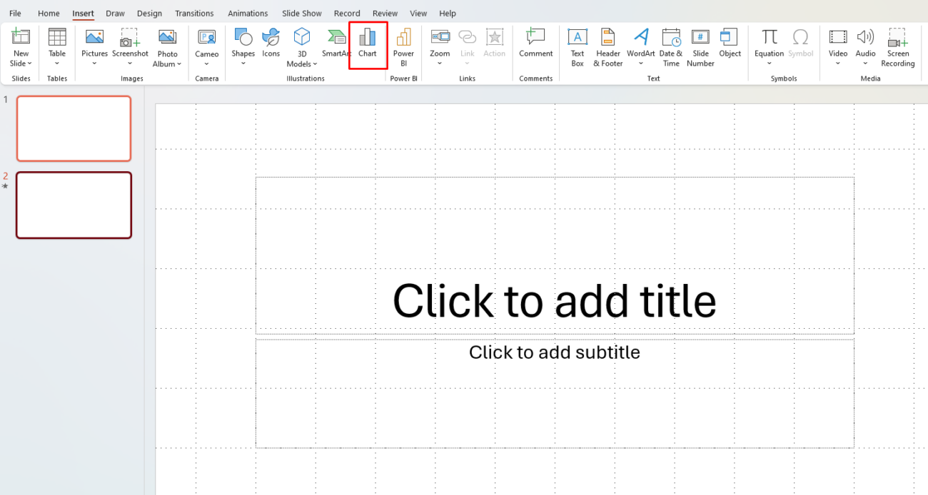
Charts are the most common way to display data-driven slides. Depending on the type of data you’re presenting, choose the right chart type:
- Bar and Column Charts: Best for comparing values across categories.
- Line Charts: Ideal for showing trends over time.
- Pie Charts: Useful for displaying parts of a whole.
- Area Charts: Good for showing quantities over time, especially when you want to highlight trends.

Example:
If you’re comparing sales data over the last year, a line chart could effectively show the upward or downward trends in monthly sales.
2. Infographics
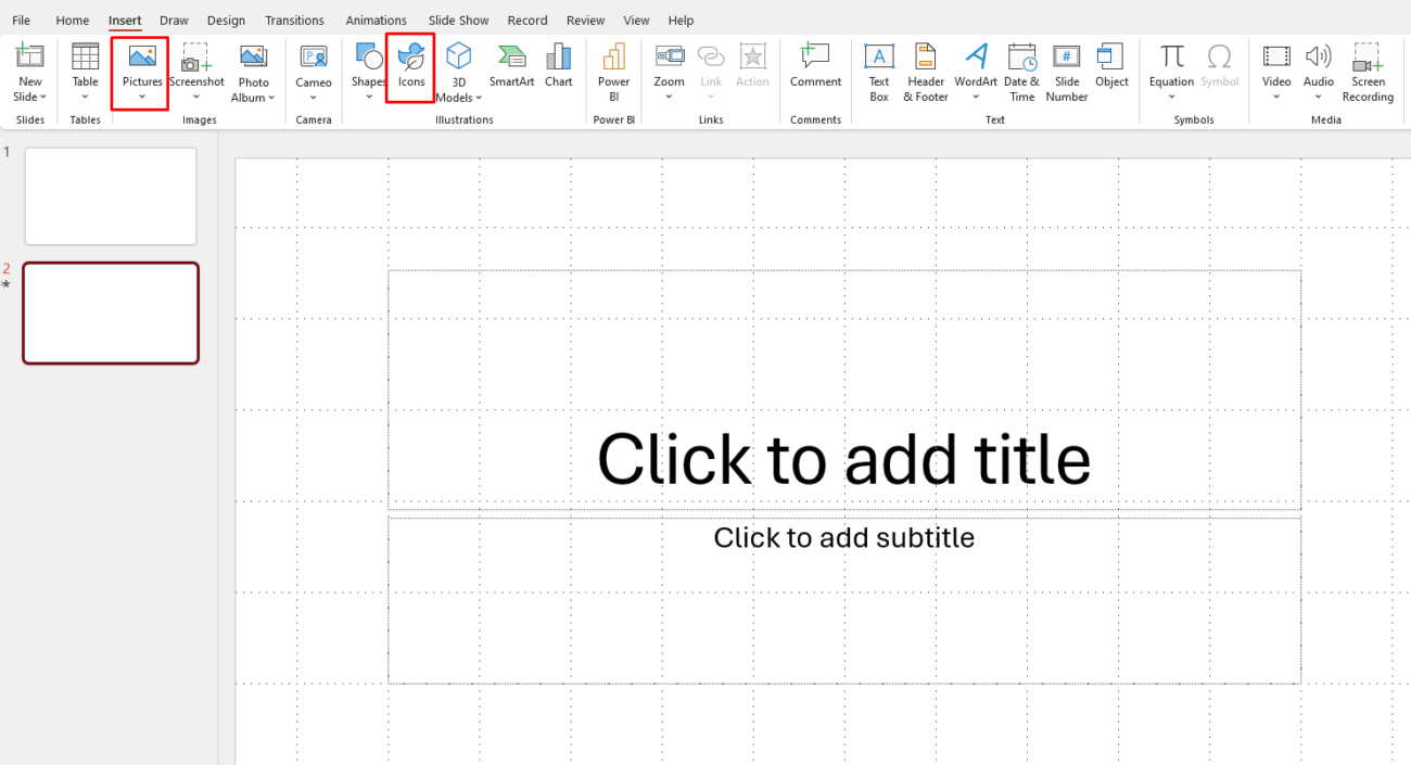
Infographics are a creative and engaging way to present data. Use them when you want to highlight data alongside icons, images, or illustrations. Infographics can help break down complex data into more accessible visuals.

Example:
For a presentation on company growth, you could use an infographic to show the increase in employees, revenue, and market share.
3. Tables
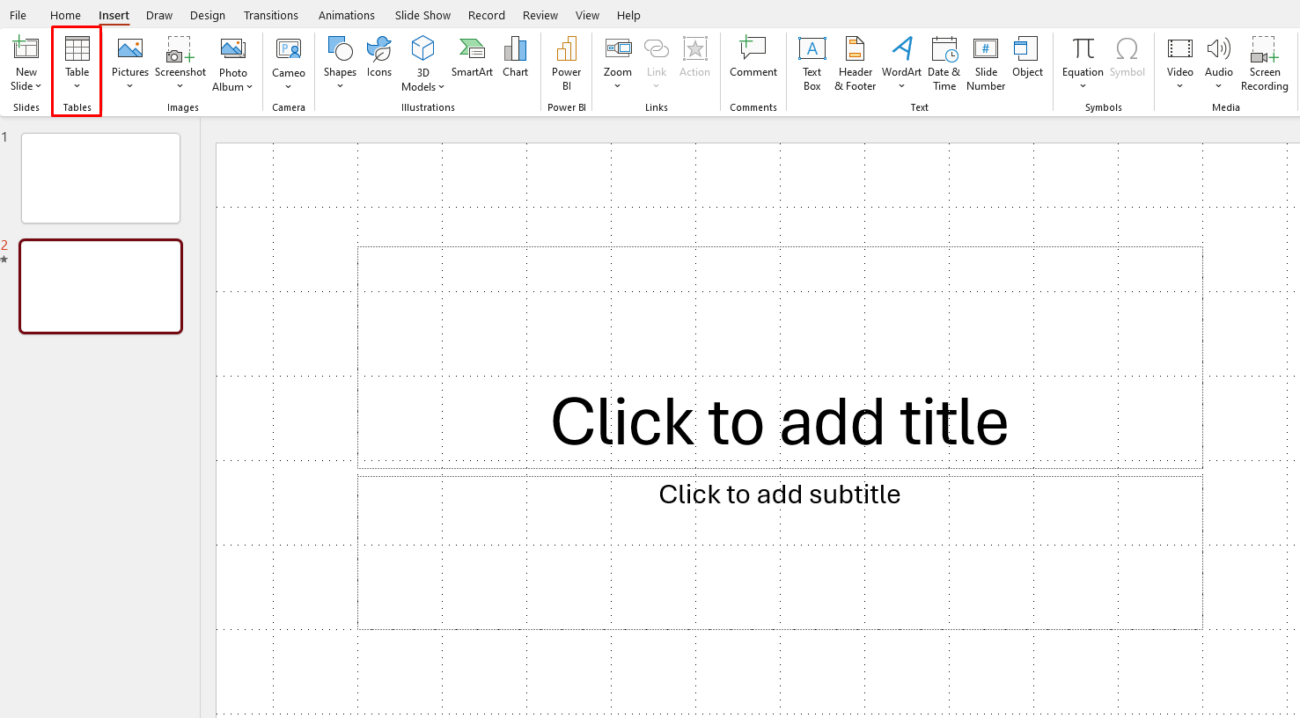
Sometimes, presenting the raw numbers directly in a table is more effective, especially if your audience needs to compare several figures. PowerPoint allows you to format tables to look sleek and professional.

Example:
A quarterly financial breakdown is often easier to read as a table, where each row represents a different quarter, and columns show revenue, expenses, and profits.
Step 3: Integrate Data from Excel
Excel and PowerPoint work seamlessly together to bring your data to life. Here’s how you can make the most of Excel’s power in your PowerPoint slides:
Embed Excel Data
You can directly embed an Excel worksheet into PowerPoint to retain its functionality and allow for updates in real time. This is ideal if your data is subject to change.
- Copy your data from Excel.
- Paste it into PowerPoint as an embedded object (Choose Paste Special and select Microsoft Excel Worksheet Object). This allows you to double-click on the table in PowerPoint and edit it in Excel.
Link Excel Charts
If you want to display charts that update automatically with Excel, linking charts is a great choice. Any changes made in the Excel file will automatically reflect in PowerPoint.
- In Excel, create your chart.
- Copy the chart and paste it into PowerPoint as a linked object (Select Paste Special and choose Paste Link).
Step 4: Add Data Labels & Annotations
Adding data labels and annotations to your visuals makes them even more impactful. Here’s how you can add clarity:
- Label key data points: Always label your charts, especially important data points, so your audience can quickly grasp the numbers.
- Annotations: Use text boxes or callouts to highlight trends or anomalies in the data.
- Color Coding: Use colors strategically to draw attention to specific areas, like using green for positive growth and red for losses.
Step 5: Design for Clarity and Impact
Good design is essential when creating data-driven slides. While it’s important to display information clearly, you also want your presentation to be visually appealing and professional.
Design Tips:
- Keep it Simple – Don’t overload your slides with too much information. Focus on key metrics and insights.
- Use Contrasting Colors – Ensure that text is readable by using high contrast between text and background.
- Align Objects – Make sure your charts, text, and data labels are aligned for a clean and organized look.
- Limit Fonts – Stick to one or two fonts to maintain consistency.
Step 6: Tell a Story with Your Data
The most effective data-driven presentations don’t just present facts—they tell a story. Structure your presentation in a way that leads your audience through the data:
- Introduce the Problem or Context – What is the issue you are addressing with the data?
- Present the Data – Use charts and tables to explain the situation.
- Offer Insights – Highlight the most important trends, patterns, or conclusions drawn from the data.
- Make Recommendations – What action do you want your audience to take based on the data?
Get the cheapest Office keys with instant delivery and full activation—100% genuine and secure!

