Designing Engaging Infographics in PowerPoint
Infographics are powerful tools for conveying complex information in a visually appealing way. They combine data, graphics, and text to present information succinctly and attractively. PowerPoint, a widely used presentation software, offers various features that make it an excellent platform for designing infographics. In this blog post, we’ll explore how to create engaging infographics in PowerPoint, from conceptualization to design tips and best practices.
1. Understanding the Purpose of Your Infographic
Before diving into design, it’s crucial to understand the purpose of your infographic. Ask yourself:
- What information do you want to convey?
- Who is your target audience?
- What action do you want them to take after viewing the infographic?
Defining these elements will guide your design process and help you create an infographic that meets your goals.
2. Plan Your Content
Start by gathering the data and information you want to include. Organize your content into sections that are easy to follow. A common structure for infographics includes:
- Introduction: Briefly introduce the topic.
- Key Points: Highlight important data or insights. Use bullet points or short sentences to make it easy to read.
- Visual Elements: Consider which visuals will best represent your data (charts, icons, illustrations).
- Conclusion: Summarize the main takeaways or call to action.
3. Choose a Template
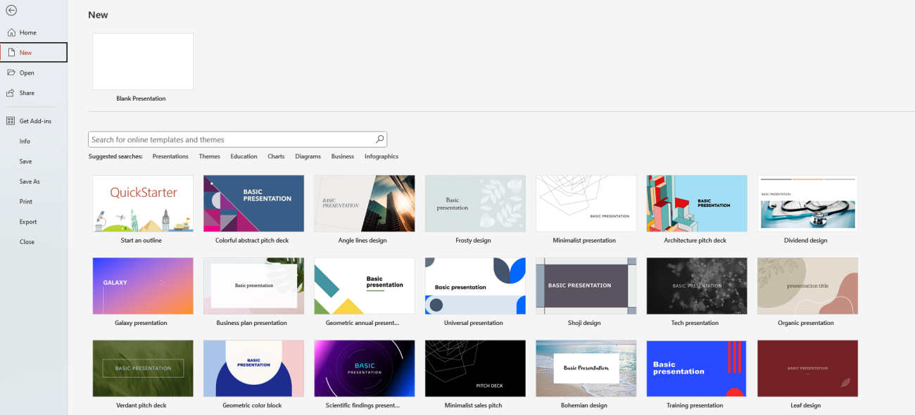
PowerPoint offers a range of templates that can serve as a foundation for your infographic. You can also create a custom template based on your branding. Here are some tips for choosing or designing your template:
- Keep it Simple: A cluttered design can distract from your message. Choose a clean layout that allows your content to stand out.
- Brand Consistency: Use colors, fonts, and styles that align with your brand identity. This helps reinforce brand recognition and professionalism.
- Grid Layouts: Consider using grid layouts to organize your information in a structured manner. Grids help maintain alignment and consistency throughout your design.

4. Utilize Visual Elements
Visual elements are crucial for making your infographic engaging. Here’s how to effectively incorporate visuals:
A. Charts and Graphs
Use PowerPoint’s chart and graph tools to create visually appealing representations of your data. Choose the type of chart that best fits your information:
- Bar and Column Charts: Great for comparing quantities across categories.
- Pie Charts: Ideal for showing proportions of a whole.
- Line Graphs: Effective for displaying trends over time.
B. Icons and Illustrations
Icons can simplify complex concepts and add visual interest. PowerPoint has a built-in icon library, or you can source icons from websites like Flaticon or IconFinder. Use illustrations to enhance your message and make the infographic more relatable.
C. Color and Contrast
Choose a color palette that enhances readability and visual appeal. High contrast between text and background colors improves legibility. Limit your color palette to 3-5 complementary colors to maintain cohesion.

5. Text and Typography
While visuals are important, text also plays a critical role in infographics. Here are some tips for effective text usage:
- Keep Text Minimal: Use short phrases or bullet points instead of long sentences. Infographics should be quick to read and understand.
- Choose Readable Fonts: Select fonts that are easy to read at a glance. Use larger font sizes for headlines and smaller sizes for supporting text.
- Hierarchy of Information: Use different font sizes and weights to create a hierarchy. This helps guide the reader’s eye through the infographic.
6. Incorporate Interactive Elements
If you’re presenting your infographic in PowerPoint, consider adding interactive elements to engage your audience:
- Hyperlinks: Link to additional resources, such as articles or websites, for deeper exploration of your topic.
- Animations: Use simple animations to reveal information sequentially. This keeps the audience engaged and allows them to focus on one point at a time.
7. Review and Revise
Before finalizing your infographic, review it for clarity and coherence. Here are some final checks to perform:
- Check for Errors: Proofread your text for spelling and grammatical errors.
- Get Feedback: Share your infographic with a colleague or friend for constructive feedback.
- Test Readability: Ensure that all text and visuals are easily readable from a distance, especially if presented on a larger screen.
Get the best deals on the cheapest Office keys, ensuring you have access to essential software at unbeatable prices!

