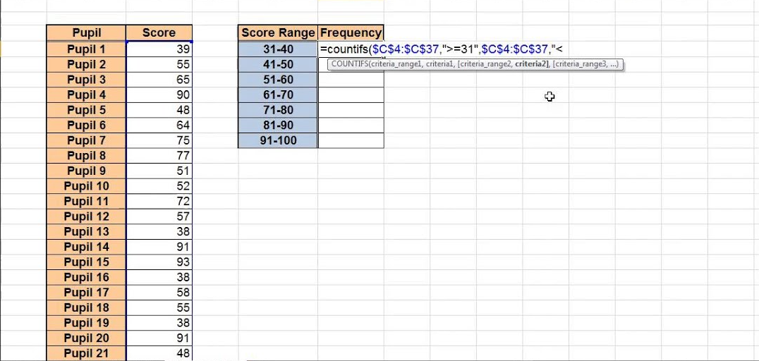
How can you Create a Frequency Distribution in Excel?
Creating a frequency distribution in Excel helps you understand how your data is distributed across different intervals. This guide will walk you through the process to create a frequency distribution easily.
Step 1: Prepare Your Data
- Open Microsoft Excel and create a new workbook.
- Enter your data into a column. For example, input your data into column A from cell A1 to A10:
A1 152 233 204 185 226 307 248 159 1810 25Step 2: Define the Bins
- In another column, define the bins that will be used to group the data. For example, input the bins into column B from cell B1 to B5:
B1 102 153 204 255 30Step 3: Select the Data Analysis Tool
- Go to the
Datatab in the Excel ribbon. - Click on
Data Analysisin theAnalysisgroup. If you don’t see this option, you may need to add theAnalysis ToolPakadd-in:- Go to
File>Options. - Click on
Add-ins. - In the
Managebox, selectExcel Add-insand clickGo. - Check the
Analysis ToolPakoption and pressOK.
- Go to
Step 4: Use the Histogram Tool
- In the
Data Analysisdialog box, selectHistogramand clickOK. - Set the
Input Rangeto the range containing your data. For example,A1:A10. - Set the
Bin Rangeto the range containing your bins. For example,B1:B5. - Select the
Output Rangewhere you want to display the frequency distribution. For example,C1.
Step 5: Generate the Frequency Distribution
- Click
OKto generate the frequency distribution. - Excel will display the frequencies in the specified output range. For example, you might see:
C D1 Bin Frequency2 10 03 15 24 20 25 25 46 More 2
Step 6: Visualize the Data with a Histogram Chart (Optional)
- Select the range containing your bins and frequencies.
- Go to the
Inserttab in the Excel ribbon. - Click on
Insert Column or Bar Chartand select the desired chart type, such asClustered Column.
Step 7: Customize Your Chart (Optional)
- Click on the inserted chart to customize.
- Use the
Chart Toolsoptions to add labels, change colors, and adjust the chart design to suit your preferences.
Step 8: Save Your Workbook
- Once your frequency distribution and any visualizations are complete, save your workbook.
- Click
File>Save As, then choose a location and filename for your work.
Unlock genuine productivity with our affordable Office Keys, ensuring you have access to the latest Microsoft Office tools for all your needs.

