How do I Create a Dynamic Chart that Updates Automatically in Excel?
Dynamic charts in Excel are incredibly useful for displaying data that changes over time. With a dynamic chart, your data range updates automatically as you add new data, eliminating the need to adjust the chart manually. This step-by-step guide will walk you through creating a dynamic chart in Excel.
Step 1: Prepare Your Data
Before you create a dynamic chart, organize your data in a structured way. Ensure that your data is arranged in columns or rows, with headers that describe the categories or series.
For example, you might have:
| Date | Sales |
|---|---|
| Jan | 100 |
| Feb | 150 |
| Mar | 120 |
As you add more rows of data (e.g., new months), your chart will automatically update to reflect the changes.
Step 2: Create a Table for Dynamic Range
Excel’s tables automatically adjust their size when you add or remove data, making them ideal for dynamic charts.
- Select your data (including headers).
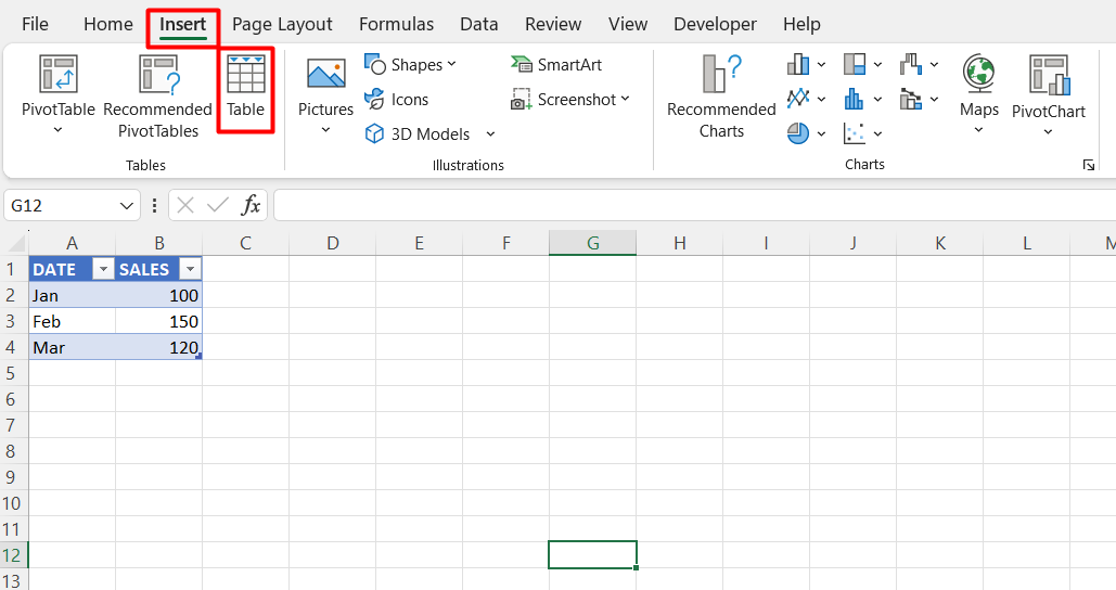
- Go to the Insert tab and click Table.
- Ensure the “Create Table” dialog box includes “My table has headers” and click OK.
Now, you have an Excel table that will expand or contract as you add or delete data.

Step 3: Insert a Basic Chart
Once your data is in a table, create a chart.
- Highlight your table data (including headers).
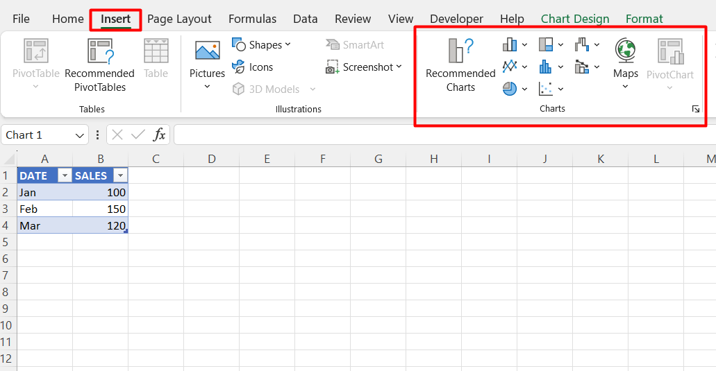
- Go to the Insert tab, and select the type of chart you want to create (e.g., Line Chart, Bar Chart).
- Excel will insert the chart based on your selected data.
This chart will now automatically update as you modify the table’s contents.

Step 4: Use Named Ranges for More Flexibility (Optional)
For more control over the data range, you can use named ranges that automatically expand as data is added.
- Go to the Formulas tab and click Name Manager.
- Click New, and name your range (e.g., “SalesData”).
- In the “Refers to” box, enter a formula like this to define the range dynamically:swiftCopy code
=OFFSET(Sheet1!$B$2, 0, 0, COUNTA(Sheet1!$B:$B), 1)
This formula dynamically adjusts the range as new data is added.
Step 5: Create a Chart with Dynamic Named Ranges (Optional)
Now that you have a dynamic named range, you can use it in your chart.
- Right-click your existing chart and select Select Data.
- In the “Chart Data Range” box, replace the current range with your dynamic named range (e.g., “=Sheet1!SalesData”).
- Click OK to apply the changes.
Your chart will now update automatically as your named range expands.
Step 6: Add New Data to Test Your Dynamic Chart
Test your dynamic chart by adding more rows of data to the table.
- Enter a new row of data (e.g., April, 180).
- The chart should automatically expand to include the new data.
If you’re using a named range, your chart will also update as new data is added.
Step 7: Customize and Format Your Dynamic Chart
Once your dynamic chart is set up, you can customize it to improve readability and presentation.
- Click on the chart to access the Chart Tools options.
- Use the Design and Format tabs to add chart titles, adjust colors, and modify chart styles to suit your needs.
Get genuine Office Keys at the lowest prices available!

