How do I Create a Gantt Chart in Excel?
A Gantt chart is a powerful visual tool that allows you to plan, schedule, and track tasks and activities over a specific period. Whether you’re managing a complex project, organizing a team’s workflow, or simply visualizing a timeline, knowing how to create a Gantt chart in Excel can help you effectively manage your work. This guide will provide you with a step-by-step tutorial on how to create a Gantt chart in Excel, enabling you to effectively plan and track your projects.
Excel offers various functionalities and features that make it a versatile tool for creating Gantt charts. We will explore the process of setting up your project data, formatting the chart, and adding necessary elements such as tasks, start dates, durations, and dependencies. Our guide will cover techniques for customizing the appearance of the chart, including choosing colors, adding labels or descriptions, and highlighting important milestones.
Step 1: Set Up Your Data:
- Open Excel and create a new worksheet.
- In column A, enter the list of tasks or activities required for your project.
- In column B, enter the start dates for each task.
- In column C, enter the duration or number of days required for each task to complete.
Step 2: Add Calculated Columns:
- In column D, label it as “End Date.”
- In cell D2, enter the formula
=B2+C2to calculate the end date for the first task. - Drag the formula down to calculate the end dates for the remaining tasks.
Step 3: Create a Stacked Bar Chart:
- Select the data range including the task names, start dates, and duration columns.
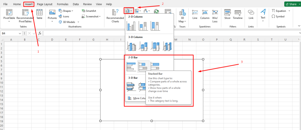
- Click on the “Insert” tab in the Excel ribbon and select “Bar” from the “Charts” group.
- Choose “Stacked Bar” from the dropdown menu.

Step 4: Customize the Chart:
- Right-click on any bar in the chart and select “Format Data Series.”
- Adjust the gap width between the bars for better visual representation.
- Format the axis labels to clearly display the dates and task names.
Step 5: Add Additional Details:
- Insert a legend to explain the color-coding of the bars.
- Add gridlines to make the chart more readable.
- Include a title and axis labels to provide context to the chart.
Step 6: Highlight Milestones:
- Identify important milestones for your project.
- Add an additional row in the data range for milestones, using the same formatting as other tasks.
- Customize these milestone bars by changing their color or adding specific markers.
Step 7: Maintain and Update the Gantt Chart:
- As your project progresses, update the start dates, durations, and milestones in your data.
- The Gantt chart will automatically adjust to reflect the changes.
- Periodically review and refresh the chart to maintain its accuracy.
Conclusion:
By following these step-by-step instructions, you can create a Gantt chart in Excel to effectively plan and manage your projects. Utilizing the powerful features and customization options available, Excel enables you to create a visually appealing and helpful tool for project management. With a well-designed Gantt chart, you’ll have better insights into task scheduling, dependencies, and overall project progress.
Shop now on our website for the best prices on Microsoft Office and boost your productivity today!

