How do I Create a Waterfall Chart in Excel?
A waterfall chart is a powerful visualization tool in Excel that helps display the cumulative effect of positive and negative values on a starting value. It is commonly used to illustrate financial data, showing the changes in a company’s profit or cash flow over a period of time. By creating a waterfall chart, you can easily identify and analyze the contributions of different factors to the overall change, making it an invaluable tool for financial and business analysis. In this article, we will guide you through the step-by-step process of creating a waterfall chart in Excel, enabling you to effectively present and interpret your data for decision-making purposes.
Excel offers built-in functionality to create waterfall charts, allowing you to easily showcase the beginning and ending values, as well as the incremental changes in between. With its intuitive interface and robust charting tools, Excel provides various formatting options to customize and enhance your waterfall chart. Whether you want to emphasize specific values, add data labels, or modify the appearance of the chart elements, Excel gives you the flexibility to make your chart visually appealing and informative.
Step 1: Prepare your data
Open Excel and enter your data into a new worksheet. Your data should have categories or labels in the first column, and corresponding values in the second column.
Step 2: Insert a new column
Insert a new column next to your values. This column will be used to calculate the cumulative values for the waterfall chart.
Step 3: Calculate cumulative values
In the first cell of the new column, enter the formula “=SUM($B$2:B2)”. This formula adds up all the values from the first row to the current row.
Step 4: Create a stacked bar chart
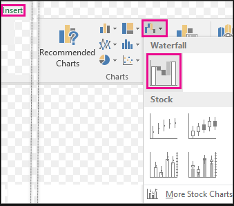
Select the data range including the categories, the original values, and the cumulative values. Go to the “Insert” tab and choose the “Stacked Bar” chart type.

Step 5: Format the chart
Right-click on any of the data bars and select “Format Data Series” from the drop-down menu. Set the fill color to a solid color or a gradient for better visual appeal.
Step 6: Remove unnecessary elements
Remove the legend if it is not necessary for your chart. You can do this by clicking on the legend and pressing the Delete key.
Step 7: Add data labels
To make the waterfall chart more informative, add data labels to each bar. Right-click on any data bar and choose “Add Data Labels” from the menu.
Step 8: Format the axis
Format the axis to suit your preference. Right-click on either axis, choose “Format Axis,” and adjust the scale, labels, or other formatting options as needed.
Step 9: Finalize your waterfall chart
Add a title to your chart and make any additional formatting adjustments to enhance its appearance. You can also adjust the chart size and position to fit your needs.
Congratulations! You have successfully created a waterfall chart in Excel. This powerful chart visualization tool is beneficial for tracking financial data, analyzing trends, and presenting information in a visually appealing way.
Unlock the full potential of Microsoft Office at an unbeatable price, providing value and productivity to users with budget-friendly solutions.

