How do you Create a Column Chart with a Secondary Axis in Excel?
Creating a column chart in Excel with a secondary axis can help you compare two different data sets with diverse value ranges effectively. Follow these step-by-step instructions to create a column chart with a secondary axis in Excel:
Step 1: Prepare Your Data
- Open Excel: Launch Microsoft Excel on your computer.
- Input Your Data:
- Start a new worksheet or open an existing one.
- Enter your data into columns. Ensure that each column has a header and that your data is organized in rows beneath these headers. For example:
| Month | Sales | Expenses ||-------|-------|----------|| Jan | 1000 | 800 || Feb | 1500 | 1200 |
Step 2: Select Your Data
- Highlight the Data:
- Click and drag to highlight the cells that include your data, including headers.
Step 3: Insert the Column Chart
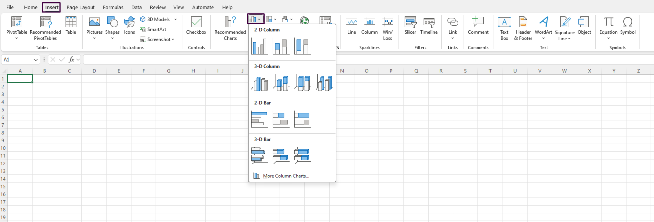
- Go to the Insert Tab:
- Click on the
Inserttab located on the Excel Ribbon at the top of the screen.
- Click on the
- Choose a Column Chart:
- In the Charts group, click on the
Insert Column or Bar Chartbutton. - Select
Clustered Columnfrom the dropdown menu.
- In the Charts group, click on the

Step 4: Assign Data to the Secondary Axis
- Select the Data Series for Secondary Axis:
- Click on any column of the data series you want to move to the secondary axis (e.g., “Expenses”).
- The selected data series will be highlighted.
- Format Data Series:
- Right-click on the highlighted data series and select
Format Data Seriesfrom the context menu.
- Right-click on the highlighted data series and select
- Move Series to Secondary Axis:
- In the
Format Data Seriespane, choose theSeries Optionstab. - Select the
Secondary Axisradio button. - Click
Close(Excel may adjust the chart immediately).
- In the
Step 5: Customize the Chart Axes
- Add Secondary Axis Titles:
- Click on the
Chart Elementsbutton (a plus sign) next to the chart. - Check the
Axis Titlesbox and chooseSecondary Vertical.
- Click on the
- Edit Axis Titles:
- Click on both the primary and secondary axis titles to edit them and add appropriate text, such as “Sales” for the primary axis and “Expenses” for the secondary axis.
Step 6: Format the Chart for Clarity
- Adjust Chart Style and Colors:
- Click on the
Chart Stylesbutton next to the chart (a paintbrush icon). - Select a style that makes your data easily distinguishable.
- Click on the
- Edit Data Labels (Optional):
- Click on the data labels within the chart to highlight them.
- Right-click and select
Add Data Labelsto view exact values on the chart.
Step 7: Final Adjustments
- Resize and Reposition the Chart:
- Click on the chart’s edges to drag and resize it as needed.
- Inspect and Adjust Axes:
- Click on each axis to adjust scale settings if necessary (right-click on axis > Format Axis).
- Here you can modify bounds, units, and other properties to refine how the data is displayed.
Get genuine Office keys at unbeatable prices to unlock the full potential of Microsoft Office for your personal or professional needs.

