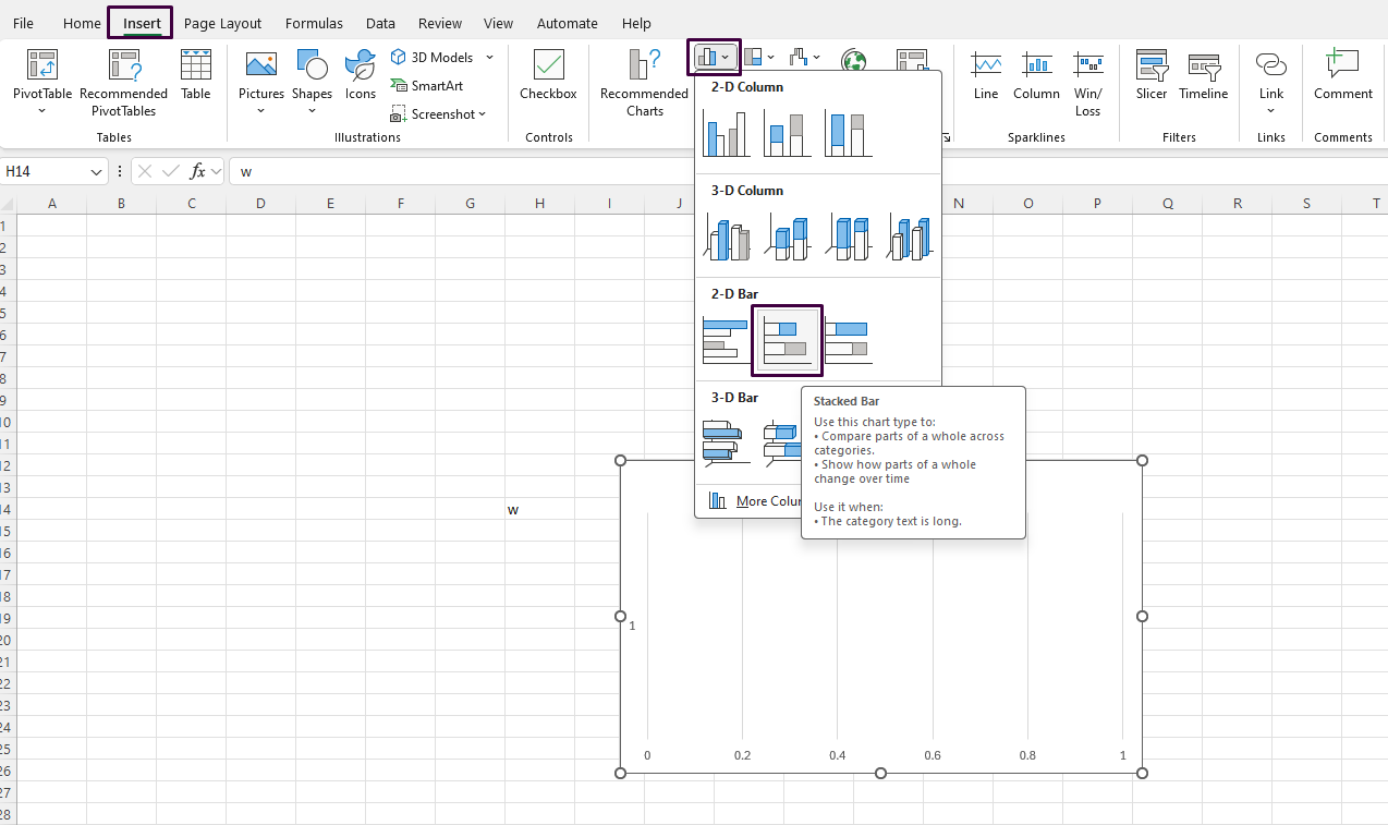
How do you Create a Stacked Bar Chart with Negative Values in Excel?
Creating a stacked bar chart that includes negative values in Excel can help visualize complex data more effectively. Follow this step-by-step guide to learn how to create a stacked bar chart with both positive and negative values.
Step 1: Open Your Excel Workbook
- Launch Excel: Open Microsoft Excel on your computer.
- Open a Workbook:
- Either create a new workbook by clicking on
New Workbook, or open an existing one by navigating toFile>Openand selecting your file.
- Either create a new workbook by clicking on
Step 2: Enter Your Data
- Prepare Your Data:
- Ensure your data is organized in a table format. For example:
Category | Positive Values | Negative Values-----------|-----------------|----------------Category 1 | 10 | -5Category 2 | 15 | -8Category 3 | 12 | -6
- Highlight Your Data:
- Select the range of cells that contains your data, including headers.
Step 3: Insert a Stacked Bar Chart
- Go to the Insert Tab:
- Click on the
Inserttab located on the Ribbon.
- Click on the
- Select the Chart Type:
- In the Charts group, click on the
Bar Charticon. - Choose the
Stacked Baroption from the dropdown menu.
- In the Charts group, click on the

Step 4: Switch Row/Column if Necessary
- Open the Chart Tools:
- Once the chart is inserted, select it to display the
Chart Toolson the Ribbon.
- Once the chart is inserted, select it to display the
- Switch Row/Column:
- Click on the
Designtab under Chart Tools. - Click on
Switch Row/Columnif the categories and values don’t appear as expected in the chart.
- Click on the
Step 5: Format the Chart to Handle Negative Values
- Adjust the Axis:
- Right-click on the
Value Axis(the horizontal axis for a bar chart) and selectFormat Axis. - In the Format Axis pane, ensure that the
MinimumandMaximumbounds allow for both negative and positive values.
- Right-click on the
- Change Bar Colors for Clarity:
- Right-click on any of the bars representing your data.
- Select
Format Data Series. - Under
Fill & Line, you can choose different colors for positive and negative bars to make them easily distinguishable.
Step 6: Fine-Tune the Chart Appearance
- Add Data Labels:
- Select the chart, then click on the
Chart Elementsbutton (+). - Tick the
Data Labelscheckbox to display values on the bars.
- Select the chart, then click on the
- Customize Labels and Titles:
- Click on chart titles, axis titles, and add or edit them by typing the desired text.
- Use the
Hometab to format text (size, font, color).
- Resize and Move the Chart:
- Click and drag the chart to move it.
- Click and drag the corners or edges to resize it.
Step 7: Save Your Work
- Save the Workbook:
- Navigate to
File>Save As. - Choose a location and file name, then click
Save.
- Navigate to
Get genuine Office keys at unbeatable prices to unlock the full potential of Microsoft Office for your personal or professional needs.

