How to Create Dynamic Reports in Excel?
Dynamic reports are a powerful way to present data in Excel, offering real-time insights with interactive features. Whether you’re analyzing sales data, monitoring KPIs, or summarizing trends, dynamic reports allow you to easily update and interact with your data. This guide will walk you through creating professional and functional dynamic reports in Excel.
1. What Are Dynamic Reports?
Dynamic reports are flexible and interactive dashboards that update automatically as data changes. They enable users to:
- View key metrics at a glance.
- Filter and drill down into specific data points.
- Save time with automated updates.
2. Preparing Your Data
Before building a dynamic report, ensure your data is clean and organized:
Structure Your Data
- Use headers for columns (e.g., “Date,” “Category,” “Sales”).
- Remove duplicates or irrelevant information.
Format as a Table
- Select your dataset.
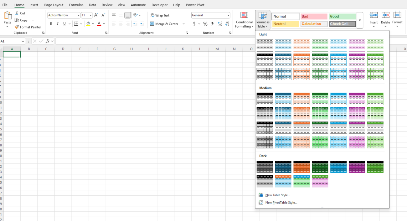
- Go to the Home tab and click Format as Table.
- Choose a style and ensure the “My table has headers” option is checked.

Tables in Excel automatically expand when new data is added, making them perfect for dynamic reports.
3. Use Pivot Tables for Dynamic Summaries
Pivot Tables are a cornerstone of dynamic reports in Excel. They allow you to summarize, analyze, and rearrange data easily.
Create a Pivot Table
- Select your dataset or table.
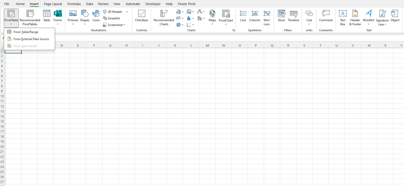
- Go to the Insert tab and click Pivot Table.
- Choose a location for your Pivot Table (new or existing worksheet).
- Drag fields into the Rows, Columns, Values, and Filters areas to build your report.

Customize Your Pivot Table
- Add Filters: Drag fields to the Filters area for easy data segmentation.
- Sort and Filter: Use drop-down menus in the Pivot Table to sort or filter data.
- Group Data: Right-click on dates or numbers and select Group to create categories (e.g., months or ranges).
4. Add Slicers for Interactivity
Slicers are visual tools that make filtering data in Pivot Tables easy and intuitive.
Insert a Slicer
- Click anywhere in your Pivot Table.
- Go to the Insert tab and select Slicer.
- Choose the fields you want to use as filters (e.g., “Region,” “Category”).
- Position the slicers on your report and adjust their size and style.

5. Use Formulas for Dynamic Metrics
Excel formulas allow you to create custom calculations and dynamic metrics:
Common Formulas for Reports
- SUMIF: Sum values based on criteria.
- Formula:
=SUMIF(range, criteria, sum_range)
- Formula:
- COUNTIF: Count values based on criteria.
- Formula:
=COUNTIF(range, criteria)
- Formula:
- IF: Create conditional calculations.
- Formula:
=IF(condition, value_if_true, value_if_false)
- Formula:
- VLOOKUP or XLOOKUP: Fetch specific data from a table.
Dynamic Named Ranges
Use named ranges that adjust as data grows:
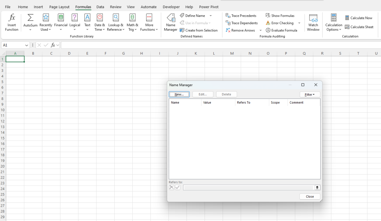
- Go to Formulas > Name Manager > New.
- Define a name and use the formula:
=OFFSET(Sheet1!$A$1,0,0,COUNTA(Sheet1!$A:$A),1).

6. Add Dynamic Charts
Visualize your data with dynamic charts that automatically update:
Create a Chart
- Highlight your Pivot Table or data range.
- Go to the Insert tab and select a chart type (e.g., Line, Column, Pie).
Link Charts to Slicers
- If your chart is based on a Pivot Table, slicers will automatically filter the chart.
Dynamic Ranges for Charts
To create a chart with a dynamic range:
- Use a dynamic named range for your data (as described earlier).
- Create the chart and set the data source to the named range.
7. Use Conditional Formatting
Highlight key insights in your report using conditional formatting:
- Select the cells or data range.
- Go to the Home tab and click Conditional Formatting.
- Choose a rule (e.g., highlight top 10%, apply data bars).
8. Automate Updates with Power Query
Power Query allows you to import, clean, and transform data for dynamic reports:
- Go to the Data tab and select Get Data.
- Import data from various sources (e.g., CSV, SQL, Web).
- Use Power Query’s editor to clean and shape the data.
- Load the data into Excel as a table or Pivot Table.
9. Save as a Template
To save time, you can reuse your dynamic report layout:
- Set up your report with all formulas, Pivot Tables, and charts.
- Save the file as an Excel Template (.xltx).
Get genuine Office Keys at unbeatable prices, offering the best value for your productivity needs.

