How do you Create a Combo Chart with Multiple Series in Excel?
Creating a combo chart with multiple series in Excel allows you to compare different sets of data using different chart types in a single chart. Follow these steps to create a combo chart with multiple series in Microsoft Excel:
Step 1: Set up Your Data
- Open Microsoft Excel and input your data with multiple series that you want to visualize.
- Organize your data in columns, with each series in a separate column.
Step 2: Select Your Data Range
- Highlight the data ranges for each series that you want to include in the combo chart.
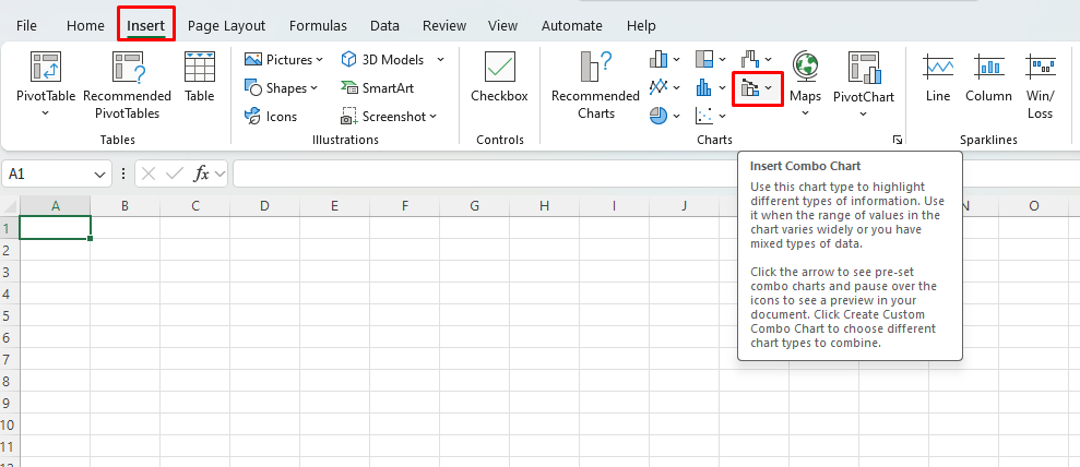
Step 3: Insert a Combo Chart
- Go to the “Insert” tab on the Excel ribbon.
- Click on “Combo Chart” and select the desired combo chart type (e.g., Line and Column).

Step 4: Customize Your Combo Chart
- Right-click on any data series in the chart and choose “Format Data Series.”
- Adjust the chart type for each series (line, column, bar, etc.).
- Modify colors, line styles, or bar widths for each series as needed.
Step 5: Add Data Labels and Titles
- Click on the data series to display the “Chart Elements” option.
- Select “Data Labels” to display values on the chart for each data series.
- Add chart titles and axis labels by clicking on the relevant options in the “Chart Elements” menu.
Step 6: Format Your Combo Chart
- Customize the chart appearance by changing the chart style, labels, gridlines, and axes to enhance readability.
- Adjust the scale of the axes to ensure all data series are effectively displayed.
Step 7: Finalize Your Combo Chart
- Resize and position the chart within the worksheet for optimal visibility.
- Add a legend to the chart to identify each data series if necessary.
- Save your Excel file to retain the combo chart and share it with others.
Get your Office Keys at the lowest prices available exclusively on our website.

