Using Excel to Build Interactive Dashboards
Interactive dashboards are powerful tools that present data visually, enabling users to analyze information and make informed decisions quickly. Microsoft Excel, a widely used and versatile software, offers robust features to build interactive dashboards without requiring advanced programming skills. In this post, we’ll guide you through creating an interactive dashboard using Excel.
Why Use Excel for Dashboards?
Excel provides several advantages when it comes to building dashboards:
- Accessibility: Excel is widely available and commonly used in both personal and professional environments.
- Flexibility: You can customize dashboards to meet your specific needs, from basic charts to complex, multi-layered visualizations.
- Ease of Use: With basic Excel skills, you can start creating dashboards quickly, and advanced features allow for more complex designs.
- Integration: Excel can import data from various sources, including CSV files, databases, and online platforms.
Steps to Create an Interactive Dashboard
1. Define Your Objectives
Start by identifying the purpose of your dashboard. Ask yourself:
- What data do you need to display?
- Who is the target audience?
- What key performance indicators (KPIs) should be highlighted?
2. Prepare Your Data
Organize your data in a structured format:
- Use clean and consistent headings.
- Remove duplicates and errors.
- Ensure numerical data is formatted correctly for calculations.
Consider using a separate sheet in your workbook to store raw data, keeping it organized and separate from the dashboard.
3. Create Pivot Tables
Pivot tables are essential for summarizing and analyzing large datasets:
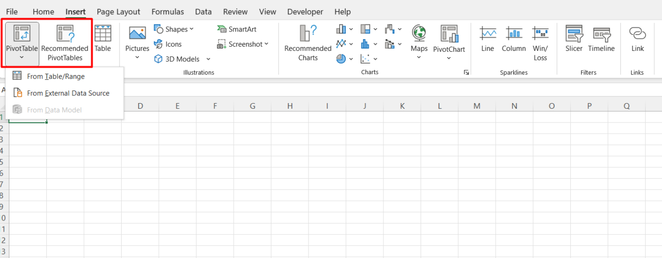
- Go to Insert > Pivot Table and select your data range.
- Drag fields into Rows, Columns, and Values to create summaries.
- Use filters to narrow down the data displayed in your pivot tables.

4. Add Charts and Visualizations
Visual elements are the heart of an interactive dashboard. Create charts that represent your data effectively:
- Bar/Column Charts: Compare categories or trends over time.
- Pie Charts: Show proportions and percentages.
- Line Charts: Highlight trends.
- Scatter Plots: Display relationships between variables.
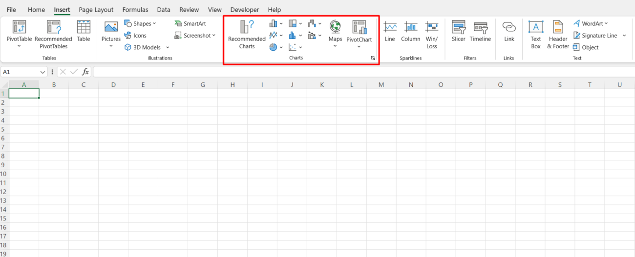
To insert a chart, select your data and go to Insert > Chart.

5. Implement Slicers and Timelines
Slicers and timelines allow users to filter data interactively:
- Select a pivot table or chart, then go to Insert > Slicer to add filters for specific fields.
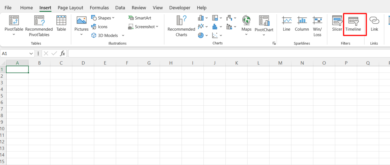
- Use Insert > Timeline for date-based filtering.
Arrange slicers and timelines on your dashboard for easy access.

6. Design Your Dashboard Layout
An effective dashboard should be intuitive and visually appealing:
- Place key metrics and charts at the top for quick insights.
- Group related information together.
- Use consistent colors and fonts to maintain a professional look.
7. Link Controls to Charts and Tables
Ensure your slicers and timelines are linked to the relevant pivot tables and charts:
- Select a slicer, then go to Slicer Tools > Report Connections to link it to multiple pivot tables.
8. Test and Refine
Interact with your dashboard to test its functionality. Ensure filters, slicers, and charts work as intended. Gather feedback from potential users and make adjustments as needed.
Tips for Building Effective Dashboards
- Keep It Simple: Avoid overloading the dashboard with too much information.
- Focus on Key Metrics: Highlight the most important data points to your audience.
- Use Color Strategically: Use colors to emphasize trends, but don’t overdo it.
- Update Regularly: Ensure your data is current to maintain dashboard relevance.
Get genuine Office keys at unbeatable prices to unlock the full potential of Microsoft Office for your personal or professional needs.

