How can you Create a Histogram in Excel?
Creating a histogram in Excel is a great way to visualize the distribution of your data. This guide will walk you through the process step by step.
Step 1: Prepare Your Data
- Open your Excel workbook containing the data you want to analyze.
- Ensure your data is organized in a single column or row without any empty cells.
Step 2: Add the Analysis ToolPak
- Go to the
Filetab. - Click
Optionsto open the Excel Options dialog box. - Select
Add-insfrom the left sidebar. - At the bottom of the window, select
Excel Add-insfrom theManagedropdown menu and clickGo.... - Check the box next to
Analysis ToolPakand clickOK.
Step 3: Create the Bin Range
- Determine the range of values in your data set.
- Create a new column where you’ll define the bins (intervals) for your histogram.
- Enter the upper boundary of each bin in separate cells of this new column. For example, if your data ranges from 1 to 100, you might set bins at 10, 20, 30, etc.
Step 4: Insert the Histogram
- Go to the
Datatab in Excel. - In the
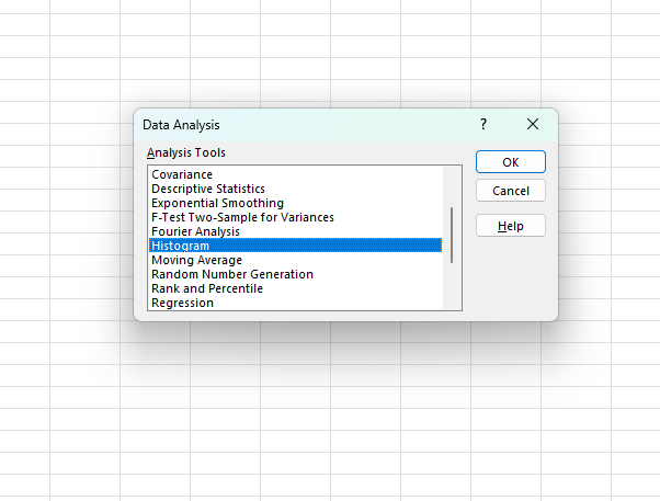
Analysisgroup, click onData Analysis. - From the
Data Analysisdialog box, selectHistogramand clickOK. - In the
Histogramdialog box, configure the following:- Input Range: Select the range of cells containing your data.
- Bin Range: Select the range of cells containing your bin values.
- Output Range: Choose where you want the histogram to be generated. You can select
Output Rangeand specify a cell, or chooseNew Worksheet Plyto generate it on a new sheet. - Check the box for
Chart Outputto automatically create a histogram chart.
- Click
OKto generate your histogram.


Step 5: Format the Histogram
- Right-click on any bin in the histogram chart and select
Format Data Series. - In the Format Data Series pane, adjust the settings to customize your histogram’s appearance, such as gap width, colors, and labels.
- Close the Format Data Series pane once you’re satisfied with the appearance.
Step 6: Add Data Labels (Optional)
- Click on your histogram chart to select it.
- Go to the
Chart Tools Designtab. - Click
Add Chart Elementin theChart Layoutsgroup. - Select
Data Labelsand choose your preferred placement for the labels (e.g., Center, Inside End).
Step 7: Save and Share Your Histogram
- Save your Excel workbook by clicking
File>Save Asand choosing a location and filename. - Share your workbook or export the histogram chart by right-clicking on the chart, selecting
Copy, and then pasting it into a document or presentation.
Unlock genuine productivity with our affordable Office Keys, ensuring you have access to the latest Microsoft Office tools for all your needs.

