How do I Create a Bar Graph in Excel?
Bar graphs, also known as bar charts, are an effective way to visually represent and compare data in Excel. Whether you’re analyzing sales figures, survey results, or any other dataset with distinct categories, creating a bar graph can help you convey your information in a clear and concise manner. With Excel’s powerful charting capabilities, you can easily create professional-looking bar graphs that provide valuable insights and make your data more accessible. In this article, we will guide you through the step-by-step process of creating a bar graph in Excel, empowering you to showcase your data effectively and make informed decisions based on your analysis.
Excel offers a range of features and customization options to create bar graphs that suit your specific needs. You can adjust the color, size, and style of the bars, customize the axis labels and tick marks, and add titles and data labels to provide additional context. Whether you prefer a simple single-series bar graph or a more complex multi-series chart, Excel has you covered. In the following sections, we will walk you through the process of creating a bar graph in Excel, starting from selecting and organizing your data, to choosing the appropriate chart type, and finally customizing and formatting the graph to ensure it accurately represents your information. Let’s dive in and unleash the power of Excel’s charting capabilities!
Step 1: Open Microsoft Excel and Load Your Dataset.
- Launch Microsoft Excel on your computer.
- Open the Excel workbook that contains the data you want to graph.
Step 2: Select the Data Range.
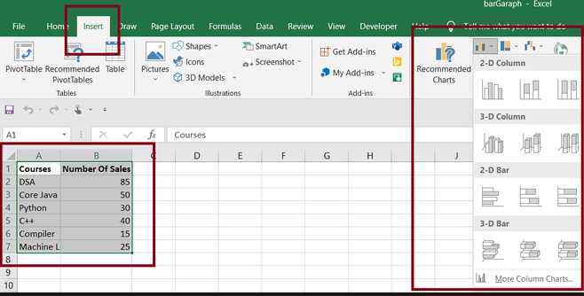
- Identify the data range that you want to include in your bar graph.
- Click and drag your mouse to select the cells that contain your data.
Step 3: Access the Insert Tab.
- Click on the “Insert” tab in the Excel top ribbon.
- Locate the “Charts” group and choose the “Bar” chart type.

Step 4: Choose the Bar Graph Style.
- A dropdown menu will appear with various bar graph styles.
- Select the desired style, such as “Clustered Column,” “Stacked Column,” or “100% Stacked Column.”
- Explore other options within the “Bar” or “Column” chart types for more customization.
Step 5: Insert the Bar Graph.
- After selecting the bar graph style, click on it to insert it into your worksheet.
- The bar graph will appear, representing your data based on the selected style.
Step 6: Customize the Bar Graph.
- Right-click on the bar graph to access formatting options.
- Select “Chart Elements” to add or remove chart components like titles, axes, or data labels.
- Choose “Chart Styles” to change colors, fonts, and other visual aspects of the graph.
Step 7: Add Data Labels (Optional).
- Right-click on the bar graph and select “Add Data Labels.”
- Choose the desired data label position, such as “Above,” “Center,” or “End.”
Step 8: Save and Present Your Bar Graph.
- Save your Excel workbook to keep the bar graph and data intact.
- Copy and paste the bar graph into other applications for presentation purposes.
- Use the print options to print your bar graph if needed.
Congratulations! You have successfully learned how to create a bar graph in Excel. By following these step-by-step instructions, you can effectively visualize your data and present it in a clear and concise manner. Bar graphs are powerful tools that can help you identify trends, compare data, and make data-driven decisions. Start creating bar graphs in Excel today and elevate your data analysis capabilities!
Unlock the full potential of Microsoft Office at an unbeatable price, providing value and productivity to users with budget-friendly solutions.

