How do you Create a Stacked Column Chart in Excel?
A stacked column chart is a powerful tool in Excel that allows you to visualize part-to-whole relationships across different categories. Follow this detailed step-by-step guide to create a stacked column chart in Excel.
Step 1: Open Your Excel Workbook
- Launch Microsoft Excel:
- Open Microsoft Excel on your computer.
- Open an Existing Workbook or Create a New One:
- To open an existing workbook, go to
File>Open, and select your file. - To create a new workbook, click on
Blank Workbook.
- To open an existing workbook, go to
Step 2: Enter or Organize Your Data
- Prepare Your Data:
- Ensure your data is organized in a tabular format.
- Each column should represent a different series or category.
- Data Validation:
- Double-check your data for any discrepancies or errors.
Step 3: Select the Data Range
- Highlight the Data Range:
- Click and drag to select the entire range of data that you want to include in the stacked column chart, including headers.
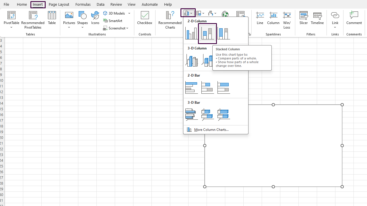
Step 4: Insert the Stacked Column Chart
- Navigate to the Insert Tab:
- Go to the
Inserttab on the Ribbon.
- Go to the
- Choose the Stacked Column Chart:
- In the
Chartsgroup, click on theInsert Column or Bar Charticon. - Choose
Stacked Columnfrom the dropdown menu under the2-D Columnsection.
- In the
- Chart Insertion:
- Excel will automatically insert the stacked column chart into your worksheet, based on the data you selected.

Step 5: Customize the Chart
- Select the Chart for Formatting:
- Click on the chart to select it. This will display additional tabs (
Chart DesignandFormat) on the Ribbon.
- Click on the chart to select it. This will display additional tabs (
- Add Chart Title:
- Go to the
Chart Designtab and click onAdd Chart Element. - Select
Chart Titleand choose a desired layout. Enter a suitable title for your chart.
- Go to the
- Add Data Labels:
- Again, in the
Chart Designtab, click onAdd Chart Element. - Select
Data Labelsand choose a preferred option to display values directly on the columns.
- Again, in the
- Customize Axes:
- Right-click on either the horizontal or vertical axes and select
Format Axisto adjust settings such as intervals, labels, and scale.
- Right-click on either the horizontal or vertical axes and select
- Change Colors:
- Go to the
Formattab. Click on individual columns to change their colors using theShape Filloption in theShape Stylesgroup.
- Go to the
Step 6: Finalize and Save Your Workbook
- Review the Chart:
- Ensure that the chart elements are displaying correctly and that the data is accurately represented.
- Save Your Workbook:
- Navigate to
File>Save As. - Choose a location, enter a file name, and click
Save.
- Navigate to
Get your Office Keys at the lowest prices available, ensuring unbeatable deals and maximum savings!

