How do you Create a Waterfall Chart in Excel?
Waterfall chart, also known as cascading or bridge charts, are useful for understanding the cumulative effect of sequential data points. This type of chart helps in visualizing subtractions and additions over a period, giving you a clear picture of how individual elements contribute to the total.
Step 1: Open Microsoft Excel
- Launch the Excel Application:
- Open Microsoft Excel on your computer.
- Open Your Workbook or Create a New One:
- Click on
Filein the top-left corner. - Select
Opento load an existing workbook or click onNewto create a new workbook.
- Click on
Step 2: Prepare Your Data
- Enter or Organize Your Data:
- Ensure you have your data organized in a list or table format.
- Typically, you will have columns for the
CategoryandValues.
- Select Your Data:
Click and drag your mouse to select the range of cells that contain your data.
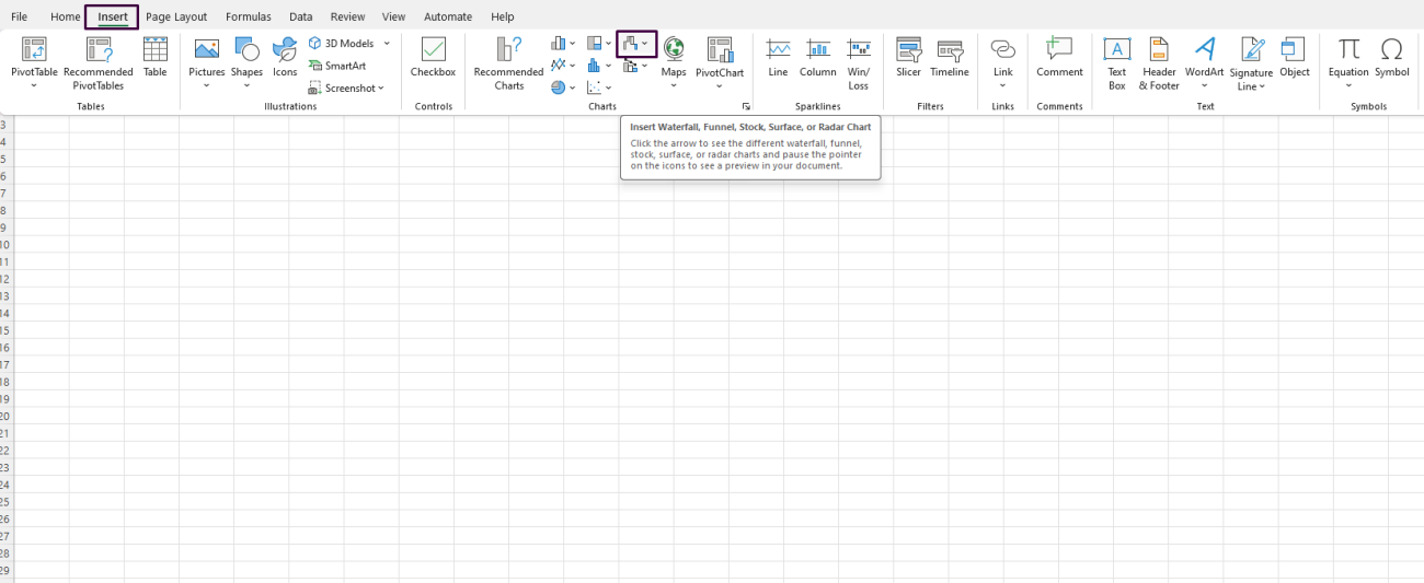
Step 3: Insert the Waterfall Chart
- Go to the Insert Tab:
- Navigate to the
Inserttab in the Excel ribbon at the top of the screen.
- Navigate to the
- Select Waterfall Chart:
- In the
Chartsgroup, click on theInsert Waterfall or Stock Chartbutton. - From the dropdown menu, select
Waterfall.
- In the

Step 4: Format the Waterfall Chart
- Set the Starting and Ending Points:
- Double-click on the
StartandEnddata points in your chart. - In the right-side pane, check the box for
Set as totalto indicate that these points are cumulative totals.
- Double-click on the
- Customize Colors and Styles:
- Click on any of the bars in the chart to select them.
- Right-click and choose
Format Data Series. - In the
Format Data Seriespane, you can change the fill color, border, and other styles to make your chart more visually appealing.
- Add Chart Elements:
- Click on the chart to activate the
Chart Toolson the ribbon. - Click
Add Chart Elementin theDesigntab. - Choose to add axis titles, data labels, legend, gridlines, etc., as per your preference.
- Click on the chart to activate the
Step 5: Adjust Axis and Labels
- Customize Axis:
- Right-click on either the horizontal or vertical axis and select
Format Axis. - In the
Format Axispane, adjust the bounds, units, and other settings to improve readability.
- Right-click on either the horizontal or vertical axis and select
- Modify Data Labels:
- Right-click on any data label and select
Format Data Labels. - Customize the label position, number format, and other settings.
- Right-click on any data label and select
Step 6: Fine-Tune the Chart
- Resize and Reposition:
- Click and drag the chart corners to resize.
- Drag the entire chart to reposition it within your worksheet.
- Modify Chart Title:
- Double-click on the default chart title and type in your desired title.
- Press
Enterto finalize.
Step 7: Save Your Workbook
- Save Your Work:
- Click on
Fileand selectSaveorSave Asto store your changes.
- Click on
Looking for a budget-friendly way to get Microsoft Office? Check out our affordable Office keys and save big on premium software!

