How to Create Stunning PowerPoint Infographics?
PowerPoint Infographics are powerful visual tools that make complex data easier to understand and more engaging to your audience. With Microsoft PowerPoint, you can create stunning, professional-looking infographics without needing expensive design software. Whether you’re presenting data, explaining a concept, or telling a story, PowerPoint offers all the tools you need to craft compelling visuals.
In this guide, we’ll show you step-by-step how to create stunning infographics in PowerPoint.
Why Use Infographics in PowerPoint?
- Visual Appeal: Infographics are eye-catching and hold the audience’s attention.
- Simplify Data: Transform complex information into digestible visuals.
- Customizable: PowerPoint’s tools allow you to tailor your design to your needs.
- Accessible: PowerPoint is easy to use, even for beginners.
1. Define Your Purpose and Content
Before you start designing, outline your goals:
- What is the message? Clearly define the key takeaway of your infographic.
- What data do you need? Organize the data or information you plan to include.
- Who is your audience? Design with your audience’s preferences in mind.
2. Choose an Infographic Template
PowerPoint offers built-in templates for infographics. To find them:
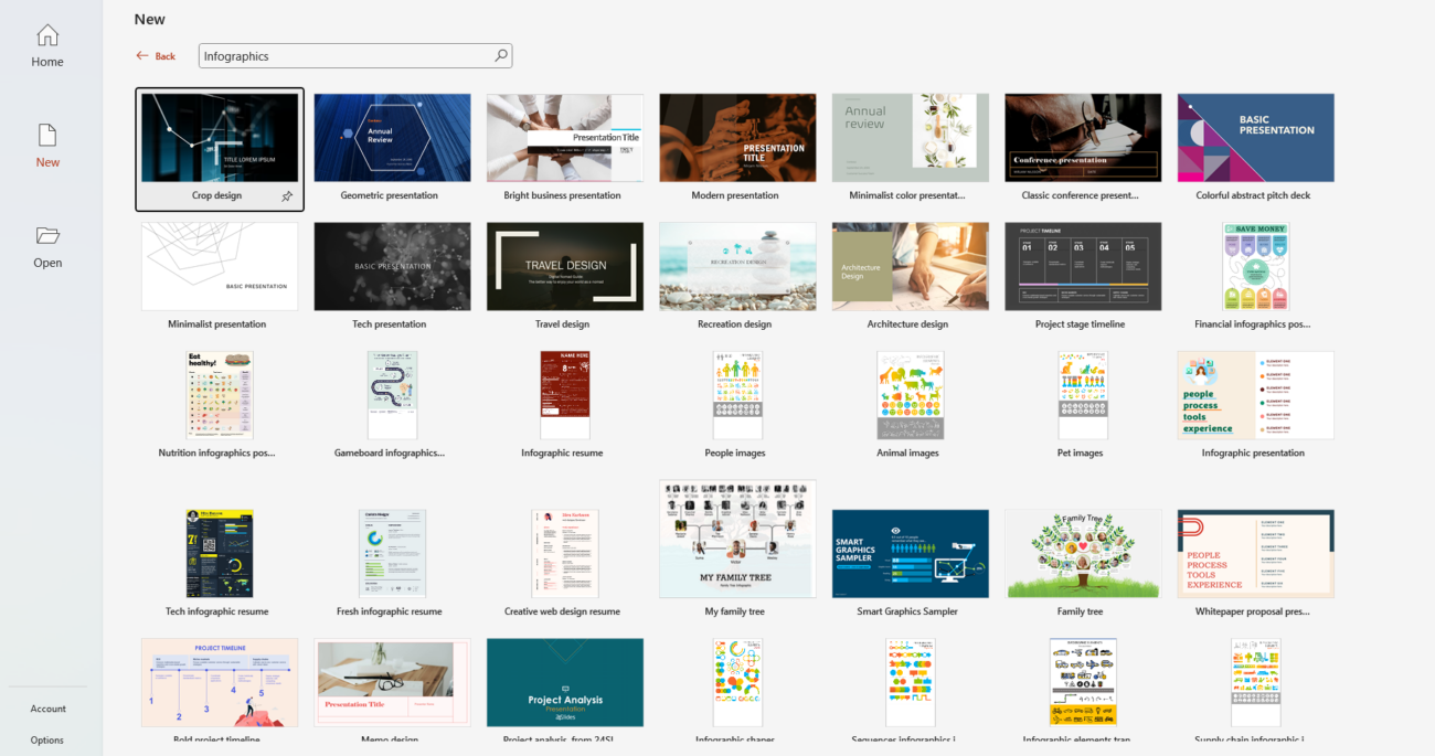
- Open PowerPoint and go to File > New.
- Search for “infographics” in the template search bar.
- Choose a template that matches your theme or start with a blank slide for full customization.

3. Set Up Your Slide Dimensions
Infographics are often shared digitally or printed, so consider adjusting the slide size:
- Go to Design > Slide Size > Custom Slide Size.
- Choose 16:9 for screens or A4 for print.

4. Use Shapes and Icons
PowerPoint’s Shapes and Icons tools are perfect for creating infographic elements:
- Add Shapes: Go to Insert > Shapes to add rectangles, circles, arrows, and more. Combine them to create unique visuals.
- Insert Icons: Use Insert > Icons to add modern, scalable icons that enhance your design.

5. Visualize Data with Charts and SmartArt
PowerPoint makes it easy to turn data into visuals:
- Charts: Go to Insert > Chart to create bar graphs, pie charts, or line graphs. Customize colors and labels to fit your theme.
- SmartArt: Use Insert > SmartArt to display processes, hierarchies, or relationships visually.

6. Choose a Consistent Color Scheme
A cohesive color palette makes your infographic look professional:
- Go to Design > Variants > Colors to choose or customize a color scheme.
- Use tools like Coolors or Adobe Color to find complementary palettes.
7. Use Typography Strategically
Your choice of fonts impacts readability and aesthetics:
- Use bold, legible fonts for headlines (e.g., Arial, Calibri, or Montserrat).
- Limit your design to 2–3 fonts for a clean look.
- Adjust font size to emphasize key points.
8. Add Images and Backgrounds
Enhance your infographic with images and backgrounds:
- Go to Insert > Pictures to add photos from your device or online sources.
- Use high-quality images that align with your message.
- For backgrounds, keep it subtle with gradients or textures.
9. Include Visual Hierarchy
Guide the audience’s focus by prioritizing key elements:
- Place the most critical information at the top or center.
- Use size, bold text, or bright colors to highlight key data points.
- Space out elements for readability—avoid overcrowding the slide.
10. Save and Export Your Infographic
Once your infographic is complete:
- Save your PowerPoint file as usual.
- Export as an image or PDF for easy sharing: File > Save As > PNG/JPEG or PDF.
- Use high resolution if printing your infographic.
Get the cheapest Office Keys with genuine licenses and instant delivery—unlock productivity without breaking the bank!

