How do you Create a Scatter Plot in Excel?
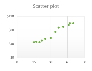
Scatter plot are widely used data visualization tools that display the relationship between two sets of numerical data. By plotting data points on a chart, scatter plots help us understand whether there is a correlation or pattern between the variables being analyzed. Microsoft Excel provides a user-friendly interface to create scatter plots, making it accessible even to those without extensive technical knowledge.
In this tutorial, we will walk you through the step-by-step process of creating a scatter plot in Excel. Whether you’re a student analyzing experimental data, a researcher examining market trends, or a business professional looking for insights into sales performance, mastering scatter plots can greatly enhance your ability to interpret and communicate data effectively. With Excel’s powerful features and flexibility, you can easily customize your scatter plots to convey your desired message visually.

Step 1: Open Microsoft Excel
- Launch Microsoft Excel on your computer.
Step 2: Prepare Your Data
- Enter your data into two adjacent columns in Excel.
- Ensure that each data point is appropriately aligned with its corresponding value in the other column.
Step 3: Select the Data Range
- Highlight the entire data range by clicking and dragging your mouse over the cells that contain the data points.
Step 4: Navigate to the “Insert” Tab
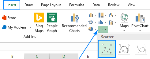
- At the top menu in Excel, click on the “Insert” tab.
Step 5: Click on “Scatter” Chart Type
- In the “Charts” section on the “Insert” tab, click on the “Scatter” chart type.
- Choose the scatter plot subtype that best suits your data interpretation needs. (e.g., Scatter with Straight Lines)

Step 6: Customize the Scatter Plot
- With the scatter plot selected, you can modify various aspects of it.
- Right-click on any part of the plot and select “Edit Data” to adjust the data range and series labels.
- Right-click on the plot area and select “Format Plot Area” to change the background color, fill, or border.
- Right-click on data points and select “Format Data Series” to adjust the marker style, size, or color.
- Right-click on the axis labels and select “Format Axis” to modify the scale, font, or other axis-related properties.
Step 7: Add Titles and Labels
- Click on the chart to activate the “Chart Tools” contextual tab at the top.
- Navigate to the “Layout” tab and click on “Chart Title” to add a descriptive title above the scatter plot.
- Use the “Axis Titles” option to add labels for the x-axis and y-axis.
- Ensure that your titles and labels adequately describe the data being represented.
Step 8: Save and Export
- When you’re satisfied with your scatter plot, it’s essential to save your file.
- Go to the “File” tab and select “Save” to save your Excel spreadsheet.
- You can also export your scatter plot as an image or PDF by going to “File” → “Save As” → selecting the desired file format.
Scatter plots are versatile tools for visualizing relationships between data points. By using the steps outlined in this tutorial, you can customize your scatter plots and effectively analyze your data.
Get the cheapest Office Keys from our website and unlock the power of Word, Excel, PowerPoint, and more to boost your productivity and efficiency.

