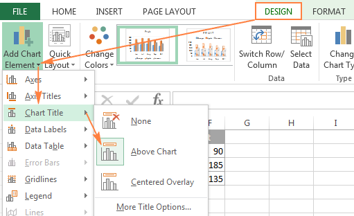
How to Add a Chart Title in Microsoft Excel?
Charts are an essential part of data analysis, providing a visual representation of your data that is easy to interpret. Microsoft Excel is a popular tool for creating charts as it offers a variety of customizable chart types and features. One important feature of any chart is the chart title as it provides context and helps to convey the purpose of the chart to readers. In this guide, we will take you through a step-by-step process of adding a chart title in Microsoft Excel, enabling you to create professional and informative visualizations.
A well-designed chart title makes it easy for readers to understand the key insights and purpose of a chart. No matter if you are presenting sales figures, financial data, or scientific measurements, a clear and concise chart title is essential to communicating the significance of your data effectively. In Microsoft Excel, the process of adding a chart title is straightforward and customizable, allowing you to create a chart title that meets your specific needs and style. By following the steps in this guide, you will be able to add a chart title to your Excel charts effortlessly and take your data presentations to the next level.
Step 1: Open Microsoft Excel and Create a Chart:
Launch Microsoft Excel on your computer and open a new or existing workbook. Select the data range that you want to represent in the chart. Go to the “Insert” tab in the Excel ribbon and choose the desired chart type from the “Charts” group, such as a column, line, or pie chart.
Specific Commands: Open Microsoft Excel by searching for it in the Start menu. Create a new workbook or open an existing one. Select the range of data that you want to include in the chart. Go to the “Insert” tab in the Excel ribbon and click on the desired chart type from the “Charts” group.
Step 2: Activate the Chart Elements:
Click on the chart to activate it. This will display the “Chart Design” and “Chart Format” contextual tabs in the Excel ribbon. These tabs contain a variety of formatting and customization options for your chart.
Specific Commands: Click on the chart to activate it and make the “Chart Design” and “Chart Format” contextual tabs appear in the Excel ribbon.
Step 3: Access the “Chart Title” Option:
In the “Chart Design” contextual tab, locate the “Chart Title” option. It is usually located in the “Labels” group. Click on the “Chart Title” button to display additional options for adding a chart title.
Specific Commands: In the “Chart Design” contextual tab, find the “Chart Title” button in the “Labels” group. Click on the “Chart Title” button.
Step 4: Choose the Chart Title Placement:
After clicking on the “Chart Title” button, a drop-down menu will appear with options for chart title placement. Select the desired placement option, such as “Above Chart” or “Centered Overlay.”
Specific Commands: From the drop-down menu that appears after clicking the “Chart Title” button, choose the placement option you prefer.

Step 5: Enter the Chart Title:
Once you have selected the placement option, Excel will add a default chart title placeholder text. Click on the default text box and enter your desired chart title.
Specific Commands: Click on the default chart title text box, delete the placeholder text, and enter your desired chart title.
Step 6: Format the Chart Title:
To format the chart title, use the formatting options available in the “Chart Format” contextual tab. These options allow you to change the font style, size, color, alignment, and other visual properties of the chart title.
Specific Commands: In the “Chart Format” contextual tab, explore the various formatting options to customize the appearance of the chart title.
By following these step-by-step instructions, you can easily add a chart title to your Microsoft Excel charts.
Buy a cheap Office Key directly from our website, offering a convenient and affordable way to access the essential software.

